A strong brand is more than just a pretty face. But that doesn’t mean a pretty face isn’t important. Enter brand design.
Brand design is the process of crafting visual identity, your brand’s signature look and feel that is instantly recognizable in a crowded market landscape. To create a visual identity that refuses to be ignored, you need strategic, intentional brand design.
In what follows, we’ll take a look at some common questions surrounding brand design, as well as some examples of strong brand design by industry:
CONTENTS
Let’s start with the central question at hand: just what is brand design, anyway?

Brand design is the process of crafting a brand’s visual identity by creating a unified system of design elements like logos, colors, typography, illustration, and photography.
A brand’s visual identity is the aesthetic embodiment of its positioning and personality. So, the most effective brand design is informed by research and guided by strategy.
When brand design is effectively executed, the insights of research and strategy come to life in touchpoints like website, marketing collateral, packaging, presentations, etc.
But before any of these touchpoints can be created, you first have to define the design elements that will go into them.

A key part of brand design is the creation of the foundational design elements that make up a brand’s visual identity.
Because they exist as components of a brand’s visual identity, it’s essential that these elements work together as a system.
It’s important to keep the system as a whole in mind when creating each of the following individual elements.
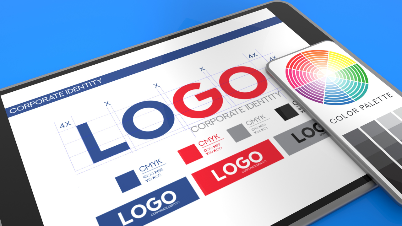
Whether it’s a wordmark, conceptual mark, or combination mark, a logo is a brand’s stamp on the world.
A logo is an aesthetic symbol full of meaning that has the power to communicate a brand’s essence in a visual instant to all who experience it.
Colors are essential to brand design. Each color has a distinct impact on the psychology of a brand’s audience. Understanding that impact is key to getting the most out of colors in brand design.
Fonts and typefaces are a unique design element in that each is a design system unto itself.
Because they are meticulously and intentionally designed, typefaces bring a distinct, readymade personality to brand design.
As defined by the sequence of cognition, shape is the most basic visual stimulus. But just because they are basic doesn’t mean shapes aren’t imbued with rich instinctual meaning.
Whether they’re obliquely suggestive or plainly representational, shapes comprise a powerful foundational component of brand design.
Illustration is another element that can impart powerful and immediate personality to brand design.
It’s important to define a cohesive and uniform illustration style, as well as be mindful of how illustrations will be used with other design elements.
Iconography is a way to communicate complex information via simplified illustrated graphics.
Part art and part science, good iconography gives designers an illustrative language inspired by the industry and medium for which it is created. Essential to effective iconography are simplicity and clarity.
Texture refers to surface quality in design. Just as tactile textures can be rough, smooth, shiny, fuzzy and so on, so can visual textures redefine the quality of a surface.
Pattern, on the other hand, is the intentional repetition of shape or form. Patterns are planned structures whose geometric nature means they can be easily mass produced.
It’s key to remember that textures and patterns are supporting elements. They should enhance the message you wish to convey, never distract from it.
Photography is a key element to brand design and includes representational imagery supporting a brand’s positioning and personality.
The style and treatment of photographic images informs their impact on brand design as much as their content.
Video is a unique and compelling way to introduce storytelling to your brand design.
Video has been proven to capture the attention of audience members longer and more thoroughly than any other medium.
Animation and motion bring otherwise static design to life in dynamic ways. Both are best used with restraint, in subtle feedback for microinteractions, for example, rather than to induce delight or entertain users.
When animation is used in a subtle and intentional way, it can help users build mental models about how a system works and how they can interact with it.
The advantage of motion is also its drawback: it attracts attention. We are sensitive and prone to be distracted by any type of motion, meaningful or not.
Interactive elements are design features that users can interact with, usually on a website or online experience.
By engaging the user in a dialectical relationship, interactive elements add a powerful character to brand design that goes beyond mere animation or motion.
Data visualization is the process of representing complex data in illustrated elements like charts and graphs.
Data visualizations should always be designed for clarity and comprehension, in addition to aesthetic appeal.
The foundation of effective brand design is the way its visual elements are organized and positioned in relation to each other. This is what is known as layout.
Layout both gives meaning to design and makes it visually appealing. It provides balance from page to page and implements an intuitive hierarchy that makes it easy to navigate visual communication.
How Do You Execute Brand Design?
When it comes to brand design, the elements outlined above are just the building blocks. Where the rubber hits the road, where a brand’s visual identity truly comes to life, is in execution.
Executing brand design isn’t magic. Effective execution is the result of a proven and well-trodden process.
So, how do you execute brand design? By following four essential steps:
All good branding begins with research. That includes brand design. Brand design should be informed by insights from market research, customer research, and internal research.
Only by understanding a brand’s market landscape, the unique needs and challenges of its customers, and the perspectives of its employees can a designer hope to lay the groundwork for a strategic approach to brand design.
Effective brand design is informed by thorough brand strategy. That includes a well-defined brand framework outlining foundational positioning elements like the brand compass, brand archetype, brand personality, etc.
A well-defined brand framework is both the blueprint and the roadmap for the visual identity that is brought to life by the brand design process.
With both the insights from research and the direction from strategy in tow, you can get to work in creating the brand design elements outlined above.
From your logo and color scheme to your typography and photography, each element should be created as an integral component to the unified aesthetic system that is your brand’s visual identity.
Touchpoints like your website, marketing collateral, and signage are where your brand’s visual identity comes to life in an interplay of brand design elements.
Creating your touchpoints is the final step of brand design, where visual elements are creatively combined to strategically communicate the brand’s key messaging.

The best way to fully appreciate brand design is to see it in action. Below, we take a look at five different brand design launches, by industry, to give you a sense of how brand design comes to life in a variety of different sectors.
The Sage Therapeutics brand design combines shape, color, and typography to achieve a modern visual identity that is fully at home within the healthcare space.
The design system puts an emphasis on an optimistic depiction of the brain and the patient stories behind it.
The Coursera wordmark is an excellent representation of the value of simplifying brand design elements as a brand evolves.
The infinity concept that joined the ‘C’ and ‘O’ in earlier iterations was simplified to a more readable, approachable design that better embodies the brand’s positioning of bringing people into the world of transformative learning.
The redesigned Brex identity features a flag symbol that is inspired by the brand’s aspirational positioning.
The flag design element represents the entrepreneurial spirit, the courage to reinvent yourself in pursuit of greatness, and the winds of change that enable Brex customers and employees to do things differently.
The Dialpad brand design represents a shift away from a one-dimensional audio wave to a new positioning centered on not just voice, but conversation.
The visual identity was created to merge the best of Dialpad’s technology with the essence of what makes it human: the power of shared conversation.
MassMutual’s positioning is founded on the idea that people are inherently reliant on one another, whether at home, in the workplace, or in the community.
The brand’s visual identity celebrates these relationships, underscoring that when people depend on each other, they are not only more secure, but happier and more fulfilling.
Your brand’s visual identity is critical to its differentiation and memorability. In order to forge a visual identity that turns heads and is impossible to forget, you need expert brand design.
From your logo and colors to your typography and photography, the brand design elements that make up your visual identity are each integral components in a cohesive aesthetic system.
The best brand design brings those elements to life with a constant eye towards the positioning and personality of the brand itself.

EVERYTHING YOU NEED TO KNOW ABOUT REBRANDING YOUR COMPANY.